Simply Mixology
How I built a cocktail recipe website with 90% user satisfaction
Imagine it’s hot outside, you had a long day at work, and you’re looking to unwind by making a delicious, refreshing cocktail.
You know what you want: a mojito.
You search for a recipe but it takes you a long time to find one where you’re not scrolling the page trying to find the ingredients and directions. There’s too much clutter. You’re tired and you want to make your cocktail quickly–right now.
This is where Simply Mixology comes in.
In this case study, I’ll show you why I wanted to design a cocktail recipe website. Why I decided to build an actual website. How I got there and how it made me a better designer by showing me that we can’t always find perfect solutions in the designs that we build.
Role: Lead product designer
Team: Solo project
Year: 2025
Timeline: 1-month
Challenges
How might we…
I picked some questions that would anchor my design and processes later. (Please note that these are our throughlines for the case study.)
How might we balance page load time, be feature-rich, and have easy-to-read and find information all on one recipe page?
How might we display favorites?
How might we display ratings and reviews?
How might we get a website up easily and quickly?
Solving for whom?
I’m designing for users who want to find cocktail ingredients and directions easily. This is a big pain point for recipe website users. And a pain point when I conducted my user interviews.
Process
A cyclical timeline
I worked on how the design process is: a messy, non-linear experience with some backtracking. Too many case studies show a linear, perfect world process. This is not that story.
Figure 1: The iterative design thinking diagram from NN/g.
I went brainstorming → sketching → user interviews → competitive feature analysis → interview analysis → sketching → personas → customer journey map → card sorting → sketching → low-fidelity wireframes → prototyping → usability testing → feedback incorporation → iterating → user satisfaction questionnaire.
From an idea
I had to go back to the drawing board several times to tackle these challenges. I started with an idea - to create an easy-to-read website for mixologists. From this idea, I immediately went into sketching. This is where I started to define the scope of the project.
From sketches, I started compiling questions that I wanted to ask users during user interviews. Questions like:
How long does it take you to find the recipe ingredients and directions?
How important are recipe ratings and reviews to you?
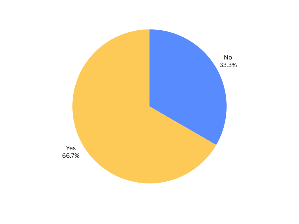
Do you favorite recipe pages?
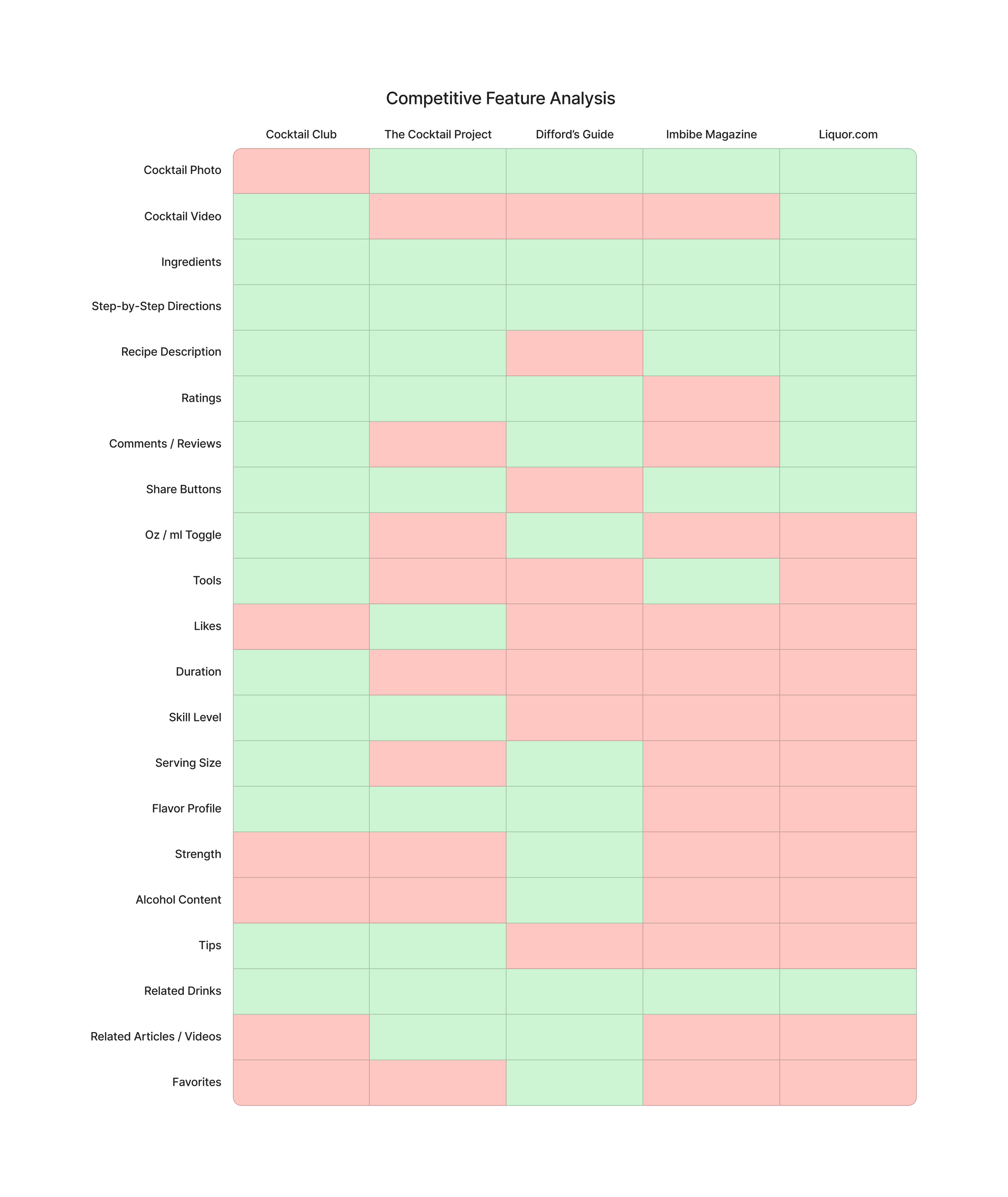
At the same time, I started looking at competitors. What were they doing on their websites? What features did they have? From there, I performed a competitive feature analysis that looked at what was included on each recipe page.
Simplicity is key
I found out that users didn’t want to have a lot of features for their recipe pages. I had asked the following challenge question:
How might we… be feature-rich…?
Only to find out from interviews that they wanted the opposite. Above everything else, they wanted directions and ingredients.
The famous Steve Jobs quote came to mind:
“Simple can be harder than complex. You have to work hard to get your thinking clean to make it simple.”
Favorites, ratings, and reviews
To answer two more challenge questions, user interviews gave us more insight.
Outside of directions and ingredients, users asked for favorites, ratings, reviews, and, surprisingly, a tool list.
Back to the drawing board
After creating more sketches, personas, a customer journey map, an information architecture map through card sorting, and sketches, I landed on low-fidelity wireframes.
These were now going to be simple recipe pages.
Prototyping
A controversial take, but I decided to bypass high-fidelity wireframes because they were redundant. Why spend the extra time creating wireframes that suit a perfect world experience? I could design and prototype with the design system I wanted to use.
Next, I had to answer the fourth challenge question. How might we get a website up easily and quickly? I had to choose the right tool.
I chose Squarespace. Its design system was established and easy to use. Style guides already existed. I could build the website quickly, too.
Then came the caveats.
Needs versus reality
Big questions now formed. The design system could only do so much. Did I choose poorly? I wondered. You can’t favorite. Reviews are locked behind a purchase. And a dynamic filtering system couldn’t be applied to my web content.
So what did I do?
The solution: no favorites. And reviews are comments you can leave on recipe pages.
Now to test for the remaining challenge questions.
Testing the solution
I decided to test the first iteration of the website with the same 3 users I conducted interviews with.
I gave them simple tasks. One of them was:
Go to the mojito recipe page and find the directions.
I found that all 3 users could reach their task destinations in under 20 seconds. This was a success for ease of access and navigation.
For ratings and reviews, users could also navigate to comments easily.
When I asked follow-up questions, I found out that users wanted to search by ingredients. I originally knocked this out of my design for simplicity.
I went into the second iteration.
Solution
Impact
I was able to solve some of my challenge questions. Namely, easy-to-find cocktail details and the ability to get a product up easily, quickly, and cheaply.
But some of it wasn’t solved. I couldn’t add favorites. A solution: users can bookmark recipe pages. They often do anyway. Users can’t rate. Solution: they can leave reviews by commenting.
And users were happy with the product. I went back to empathizing by having a short follow-up interview consisting of the 10-question SUS questionnaire.
90% of the users were satisfied with the end product.
Learnings
This project taught me that there can often be a discrepancy between what we design and what we can build.
It also taught me that simple is better. Just like the Steve Jobs quote above, it’s harder to design simpler. You can directly see this with users wanting to search by ingredients. I made it too simple in the initial product.


